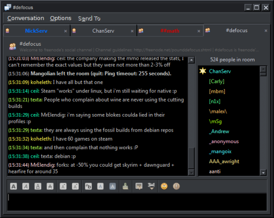
This website, along with many others, is upside down. The design is back to front. New posts should appear at the bottom, not the top. “But then we’d have to scroll so much” you say. Ah, but the scroll bar should also start at the bottom.
We read left to right, top to bottom. This layout is left to right, bottom to top. It’s actually a combination of bottom to top. Each individual post appears top to bottom (ie the sentences appear in the correct order, not backwards), yet the posts are ordered bottom to top.
This is most annoying on twitter. Threads of conversations are backwards. Instead of:
John: Hey, how are you?Michael: I’m great thanks. And yourself?John: I’m OK.Michael: It was nice talking with you, byeJohn: Goodbye.
On twitter it reads:
John: Goodbye.Michael: It was nice talking with you, byeJohn: I’m OK.Michael: I’m great thanks. And yourself?John: Hey, how are you?
Users have to change from their standard way of reading to reading backwards.
Facebook has a different approach. It puts threads of comments in the right order but insists on ordering separate items backwards.
Here you see the order of the comments appearing chronologically but the order of the posts ordered backwards chronologically.
Websites should be designed the same way chat clients are.

I’m not suggesting that sites should show the oldest article first, my point is that the newest articles should be at the bottom not at the top just like how the newest message in chat clients appear at the bottom.
The philosophy of a design should be to minimize the amount of time a user has to learn the interface and try to be as similar as possible to other interfaces the user has used previously to avoid getting mixed up from time to time.
Almost all websites are like this. It’s quite sad actually. Sort of like how every website puts black on white background instead of white on black. It’s the exact opposite of the best solution. I don’t think I’ve ever seen a site where the items were ordered properly, which is quite disappointing – at least someone out there should be trying to do it the right way around.


Website upside down eh? This is how its done:
http://floris.ruwhof.net/upload/upsidedown.html
Redesign your blog indexes the way you suggest. Scrolling to the bottom/last page for the most recent post doesn’t sound like the best solution to me 🙂
The scroll bar would start at the bottom. If you wanted to read older posts, you would scroll upwards.
Now I know you’re either trolling or not thinking this through. If my window is not as tall as the post, I would have to scroll up to start reading that post. Then I would scroll down to read the rest of that most recent post. Then to read the next post I would have to scroll up again past the first post to get to the second. If that one is longer than my window, I would then have to scroll down again. Most recent post at the top makes it so that I only have to scroll down at any time to continue reading, and see previous posts.
Dear sir /madam I am Tagay Takele from ethiopia.I have got my B.Sc in applied mathemetics at university of GO,oARNEthiDpia.But know i wanna attend my M.Sc program there in mathematics science specially in NUMERICAL analysis .so help me as much as you can.I wait for your responce. Thank you.sincerely yourstagay takele
What’s that about white-on-black? Your page is harder to read (for me) than Facebook, email, and BOOKS which all use black-on-white ..
black-on-FFFFFF on a CRT monitor could lead to headaches, but that is easily fixed by using an LCD, or using light grey instead of black.
Great arecilt, thank you again for writing.
I discovered your weblog web site on google and test a number of of your early posts. Continue to maintain up the very good operate. I just further up your RSS feed to my MSN News Reader. Seeking forward to reading extra from you later on!…
Of course WordPress is primarily for blogs not journals. However, WordPRess can also accomodate journals. If you want a journal, with earliest posts first, append order=asc to the posts page URL, e.g. https://emphatious.wordpress.com/?order=asc for this blog. If you set a static home page you can have a link to the posts page giving this order.
I guess finding useful, reliable infromation on the internet isn’t hopeless after all.